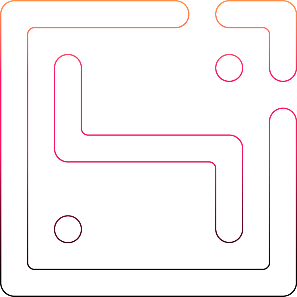
The "Hi" element represents a greeting—the beginning of a meaningful partnership. At HiDesign, people and understanding come first. We believe that effective design starts with listening carefully and understanding the right problem to solve.
+
D
DIRECTION & CREATIVITY
The letter "D," representing Design, is combined with the computer cursor symbol to reflect creativity in the digital world. This combination emphasizes purposeful thinking, precision, and a technology-driven approach behind every design decision.
+
GROWTH & BREAKTHROUGH
The upward arrow symbolizes growth and the drive to move forward. HiDesign accompanies businesses throughout their journey of growth by optimizing experiences and creating long-term value.
Typography
Alexandria
Alexandria is the typeface chosen as the foundation of the HiDesign logotype. Its combination of sharp edges and subtle curves creates a balance between systematic precision and creative flexibility.
Aa Bb Cc Dd Ee Ff Gg Hh Ii Jj Kk Ll Mm Nn Oo Pp Qq Rr Ss Tt Uu Vv Ww Xx Yy Zz
0 1 2 3 4 5 6 7 8 9
Aa
Aa Bb Cc Dd Ee Ff Gg Hh Ii Jj Kk Ll Mm Nn Oo Pp Qq Rr Ss Tt Uu Vv Ww Xx Yy Zz
0 1 2 3 4 5 6 7 8 9
Aa
Aa Bb Cc Dd Ee Ff Gg Hh Ii Jj Kk Ll Mm Nn Oo Pp Qq Rr Ss Tt Uu Vv Ww Xx Yy Zz
0 1 2 3 4 5 6 7 8 9
Aa
Aa Bb Cc Dd Ee Ff Gg Hh Ii Jj Kk Ll Mm Nn Oo Pp Qq Rr Ss Tt Uu Vv Ww Xx Yy Zz
0 1 2 3 4 5 6 7 8 9
Aa
Aa Bb Cc Dd Ee Ff Gg Hh Ii Jj Kk Ll Mm Nn Oo Pp Qq Rr Ss Tt Uu Vv Ww Xx Yy Zz
0 1 2 3 4 5 6 7 8 9
Aa
Logotype Structure
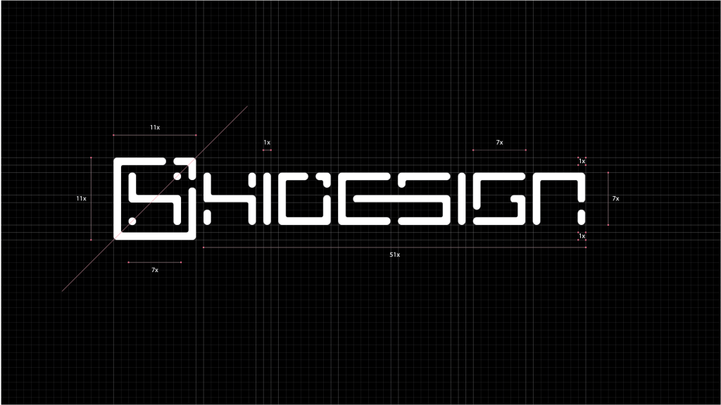
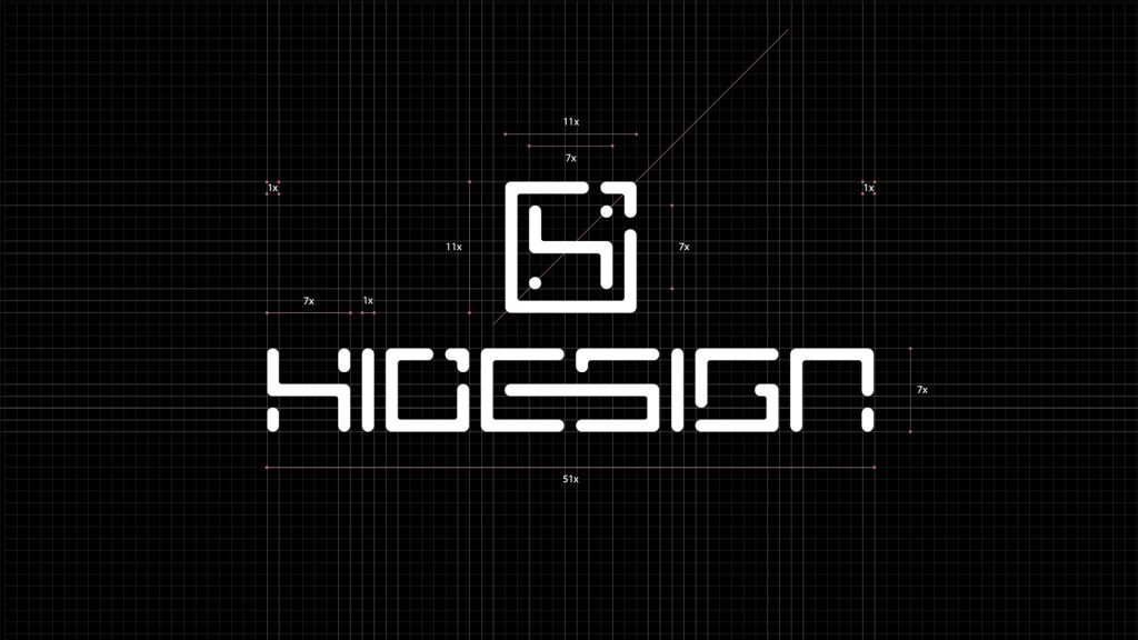
The HiDesign logotype is built from softly rounded square forms, inspired by the shape of keyboard keys. This structure evokes the digital creative environment, where every action and keystroke contributes to a complete and intentional idea. It reflects a logical, precise, and systematic approach to the design process, guided by clarity and purpose.
Brand Color System
HiDesign's color system is based on the contrast between black and white, creating a clear, minimal, and contemporary aesthetic. The gradient is used as an accent element, representing the flow of ideas and the creative energy within the digital design landscape.
Brand Patterns
The HiDesign pattern system is built from the geometric language of the logotype. Rounded lines and connecting points are repeated through a modular structure, forming a systematic graphic layer that enhances brand recognition and enriches visual depth across various design applications.
Website
The HiDesign website is designed as a digital exhibition space where projects and creative expertise are showcased in a clear and intuitive way. A minimalist interface, a technology-driven color system, and a modern layout maximize content focus while creating a smooth experience for visitors.
Beyond introducing services, the website also functions as a dynamic portfolio that reflects HiDesign's design approach, working process, and aesthetic vision.